Downloading file 1 of 1: `fiscal_sponsor_directory.csv`Introduction
The context for this week’s Tidy Tuesday dataset is slightly sad and misfortunate as I saw the post from Jon Harmon (@johnthegeek) on Linked In announcing troubles with collecting sponsorships for the R4DS Learning Community 🙁.
This is a very supportive and helpful community and if you are in the position to somehow support them, then you definitely should consider it. I’ve learned a lot from their various channels on Slack, each dedicated to a specific book or topic.
This week’s Tidy Tuesday dataset is about Fiscal sponsors.
Setup libraries and load data.
Given the context - I wanted to take a look at the number of projects that are related to Education or Data Science. Each sponsorship has a project_types column which holds info on the topic of the project. I’ve decided to label a project as educational - if one of it’s project types (there are several entries possible) contains either of the keywords {Education, Data, Science} (case-insensitive).
With this I will try to answer some questions like:
- what is the share of such projects out of the whole set ?
- are more such projects sponsored over the years ?
- are the number of criteria for such projects to get sponsorship increasing over the years ?
Code
fiscal_sponsors <-
  fiscal_sponsor_directory |>
  select(
    name,
    year_fiscal_sponsor,
    n_sponsored,
    project_types,
    eligibility_criteria,
    services
  ) |>
  mutate(
    is_project_educational = str_detect(project_types, "[Ed]ucation|[Dd]ata|[Ss]cience"),
    # "1987" -> "19870101" -> 1987-01-01
    year = {
      year_fiscal_sponsor |>
        as.character() |>
        str_c("0101") |>
        ymd()
    }
  )
Breakdown educational projects ?
Code
fiscal_sponsors |>
  count(is_project_educational) |>
  mutate(
    perc = label_percent(accuracy = 0.1)(n / sum(n))
  )
# A tibble: 3 × 3
is_project_educational n perc
<lgl> <int> <chr>
1 FALSE 144 38.9%
2 TRUE 217 58.6%
3 NA 9 2.4% Educational projects over the years
Plot the number of such sponsored projects over the years. Hopefully we see an increasing trend.
Code
# https://github.com/katiejolly/nationalparkcolors
line_colour       <- park_palette("Saguaro")[1]
annotation_colour <- park_palette("Saguaro")[6]
top_point_col     <- park_palette("Everglades")[4]


# educational per year
educational_projects_sponsors |>
  group_by(year) |>
  summarise(n_sponsored = sum(n_sponsored)) |>
  mutate(
    pointcol = ifelse(year == as_date("2013-01-01"), top_point_col, line_colour)
  ) |>
  ggplot(aes(x = year, y = n_sponsored)) +
  geom_point(aes(colour = I(pointcol))) +
  geom_line(aes(group = 1), colour = line_colour) +
  scale_x_date(
    date_breaks = "5 years",
    date_labels = "%Y",
    minor_breaks = NULL
  ) +
  scale_y_continuous(
    breaks = seq(0, 1000, 200),
    labels = label_comma(),
    minor_breaks = NULL
  ) +
  annotate(
    "text",
    x = ymd(19850101),
    y = 600,
    label = "Past records \nhappened around 1975",
    hjust = 0,
    fontface = "bold",
    lineheight = 0.8,
    colour = annotation_colour
  ) +
  geom_curve(
    aes(x = x, y = y, xend = xend, yend = yend),
    data = data.frame(
      x    = ymd(19840601),
      xend = ymd(19780130),
      y    = 600,
      yend = 545
    ),
    curvature = -0.01,
    colour = annotation_colour
  ) +
  annotate(
    "text",
    x = ymd(20000101),
    y = 970,
    label = "The record was in 2013 with 956 projects",
    hjust = 1.02,
    fontface = "bold",
    colour = annotation_colour
  ) +
  geom_curve(
    aes(x = x, y = y, xend = xend, yend = yend),
    data = data.frame(
      x    = ymd(20000101),
      xend = ymd(20120330),
      y    = 970,
      yend = 970
    ),
    curvature = -0.01,
    colour = annotation_colour
  ) +
  labs(
    title = "Number of sponsored projects related to Education, Data or Science - by year",
    subtitle = "A projects counts as related if it contains one of the keywords in it's project types entries",
    caption = "Tidy Tuesday 2024 W11 David Jankoski",
    x = NULL,
    y = "# projects"
  ) +
  theme_minimal() +
  theme(
    plot.title.position = "plot",
    panel.background = element_blank(),
    plot.title    = element_markdown(colour = annotation_colour, face = "bold"),
    plot.subtitle = element_markdown(colour = annotation_colour, margin = margin(b = 8)),
    plot.caption  = element_markdown(colour = annotation_colour, margin = margin(t = 6))
  )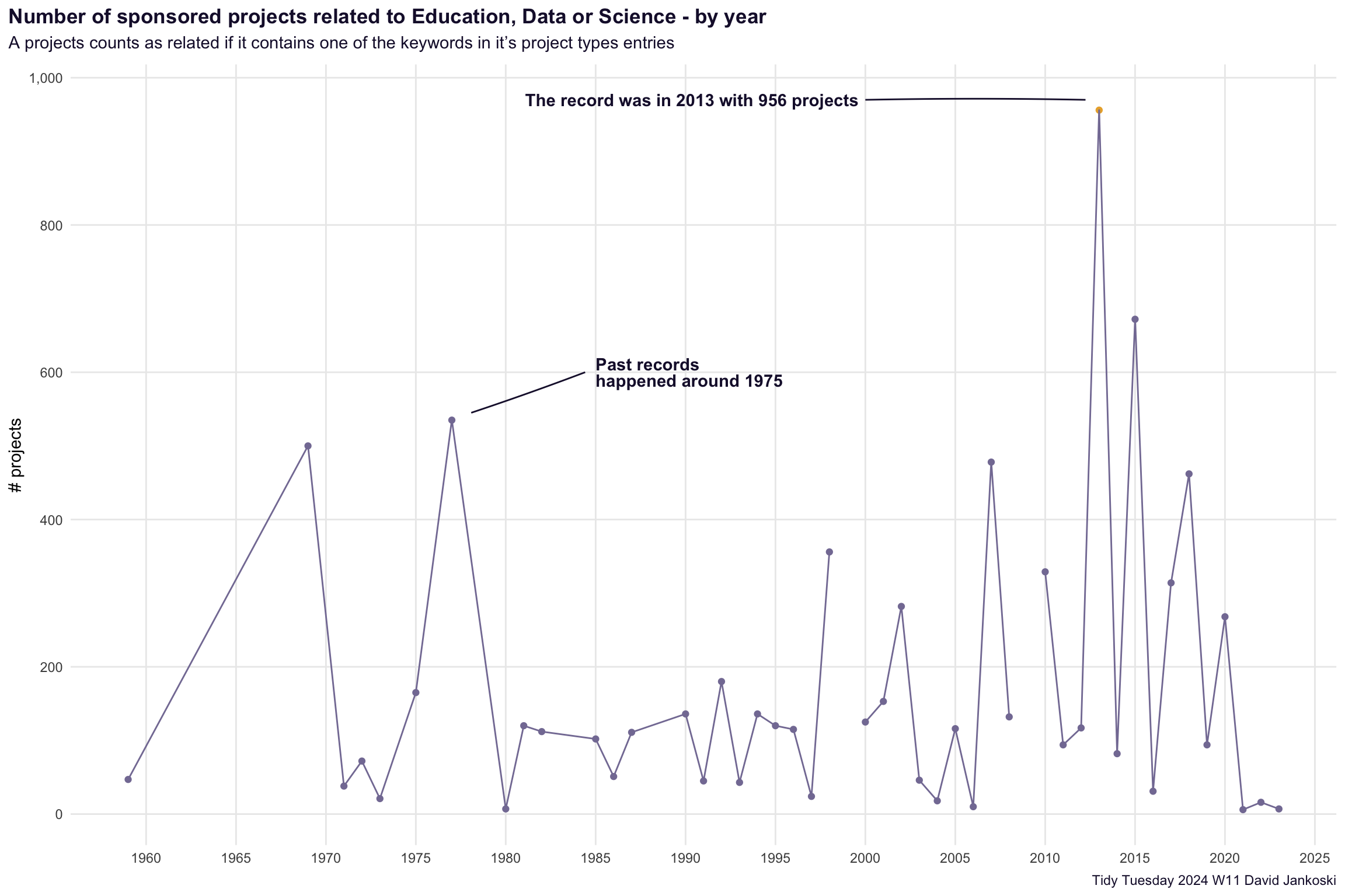
Takeaways
- there are some strange quirks in the data which i am not sure how to interpet
- there are missing values - seen by the breaks in the lines on the plot
- successive years seem to be very “jumpy”, not sure if this is realistic ?
- the general trend is that indeed such projects are increasingly more sponsored over the years
- there was a first in peak in sponsoring such projects around 1975, with more recent years 2013 reaching back to those record levels